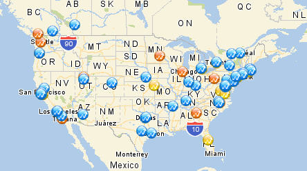
Here's how the U.S. and Canada traffic (visits) looks for insideanalytics.blogspot.com:
Feel free to download this spreadsheet to use if you'd like to map your own data. It has a few macros built in to allow you to refresh the data from WebTrends, and upload it to Yahoo's slick mapping service. I've been testing with WebTrends On Demand data, but it should work find for those of you using WebTrends software too.
The general idea is as follows. You install the WebTrends ODBC driver, and create a data source called "WTODGeo" to match what this spreadsheet is using as a default. The WTODGeo data source connects to the profile you want to use. Then you enter in the Time Period you want to use in the spreadsheet and refresh the spreadsheet with your data. Then map it using the macro!
There are more specific instructions in the spreadsheet.
I'm using the Yahoo! maps "simple" api for this only because it's VERY easy to use, and gets the general point across without much fuss. Their Flash and AJAX api's are definitely worth a look too. If someone would like to make this map even better...be my guest!
This isn't a WebTrends supported spreadsheet. Just my own creation. Use at your own risk. If you have trouble with it, or have any questions or feedback, feel free to drop me a line at elbpdx @ gmail
Quick Update: Note that even if you do not use WebTrends, you can still download the spreadsheet and use the data I have inside the spreadsheet to see the Yahoo! map. After downloading the spreadsheet, just skip all the other steps and use the macro to map the current data. It's worth it to see how easy Yahoo! maps is to use!
Filed in: analytics, visualization, map, mashup
Technorati Tags: analytics, visualization, map, mashup


